How to supply perfect files: Part 2
We want the same thing you do, for your files to print without fuss and as you intended them to print. In this post we are going to explain about CMYK colour, and how to get the most from it.
CONVERTING TO CMYK
Your computer, scanner, digital camera and monitor create images using combinations of just three colours: Red, Green and Blue (RGB). Printing presses use four different colours to print these images, Cyan (light blue), Magenta (pinky red), Yellow and Black (or CMYK, also known as Process Colour). At some stage of production, RGB images and colours must be converted to CMYK.
Conversions on images from RGB to CMYK are best done using software such as Photoshop and you should do this before sending your file to us. If you don’t perform the conversion yourself, our process will apply an industry standard profile RGB to CMYK conversion meaning that colours may not print as expected.
COLOUR TOLERANCES
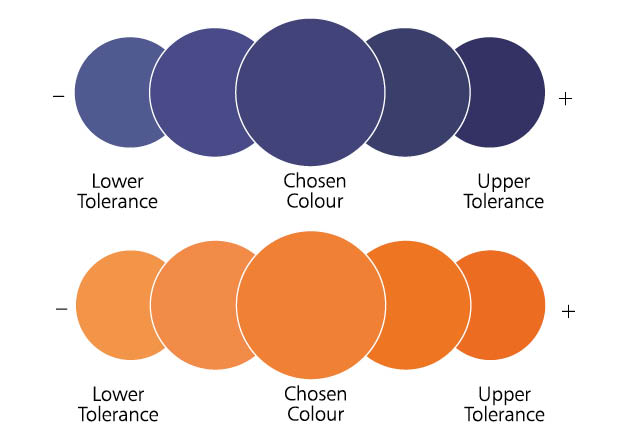
You can produce fantastic results with full colour process, and without breaking the bank. It pays to bear in mind that colour variation is inherent in any print process and you shouldn’t expect a perfect match to your chosen colour.
The examples below will give you an idea of how your chosen colour may actually look when printed. We’d be delighted to explain this in more detail, just ask.

GETTING THE MOST FROM BLACK
Black is black! Isn’t it? It may surprise you to learn that there’s more to black than meets the eye…
To get the best from our process, black can be produced in two ways. The first method is single colour black, made from 100% black ink. This is ideal for small areas less than 2cm2 such as text or logos.
On areas of over 2cm2 in size, single colour black can appear washed out and uneven. This is because the rollers on printing presses roll the ink off over a large area.
The alternative is rich black, which consists of 100% black and 40% cyan. A rich black should be used on larger areas to ensure an even, dark coverage, as the second ink colour disguises any inconsistencies. However, rich black should never be used on small text as any tiny deviance in registration will lead to a blurred effect.
You may think that it would be okay to have three or four colour black text as long as the total ink coverage is less than 300%. You’d be wrong! Black text should never have more than 140% ink coverage. Four colour black text is virtually impossible to print, will look blurred and may cause sheets to stick together.
Also be aware that black within a photograph as a background may have a different CMYK make-up to other parts of your design. This will be noticeable when printed, even if not on screen.
In the next post, we’ll be discussing how to get the best results from text and images.


